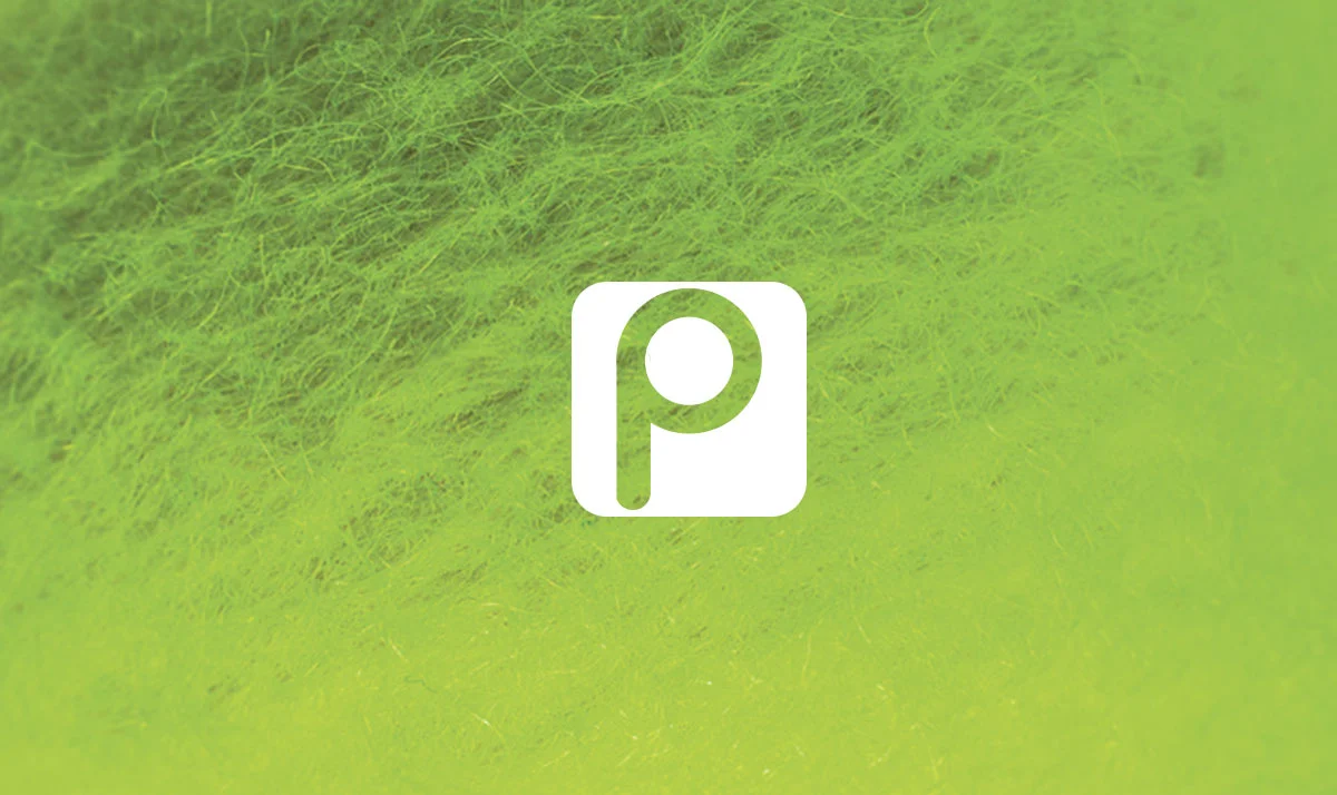
To keep Penn’s identity fresh, I did a logo redesign. Taking inspiration from a tennis net, a rounded square was used to house a more current “P”. Penn was the first tennis ball manufacturer to produce felt balls and use florescent yellow. So I pulled inspiration from their history to complete the ad concepts shown below. Click here to see digital logo explorations.
Before:
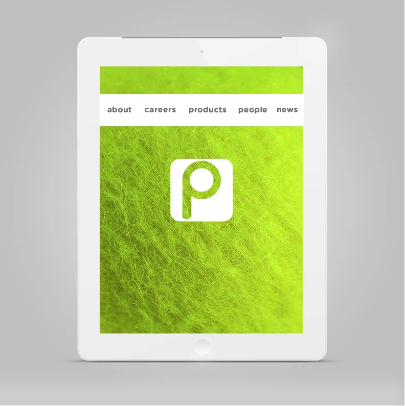
After: